android-布局介绍
布局 一.基本理论 Android六大基本布局分别是
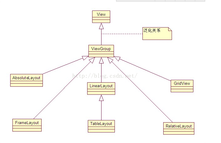
学习基本布局要理解两个比较基础概念的图:
上面这个类图只是说了六大基本布局的关系,其实ViewGroup还有其他一些布局管理器。
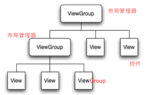
(二)Android布局的XML关系图
布局管理器里面既可以添加多个布局管理器又可以添加多个控件,而控件里面不能在添加布局或控件了。
二.各个布局的使用 (一)线性布局 线性布局在开发中使用最多,具有垂直方向与水平方向的布局方式,通过设置属性“android:orientation”控制方向,属性值垂直(vertical)和水平(horizontal),默认水平方向。
android:gravity:内部控件对齐方式,常用属性值有center、center_vertical、center_horizontal、top、bottom、left、right等。
center:居中显示,这里并不是表示显示在LinearLayout的中心,当LinearLayout线性方向为垂直方向时,center表示水平居中,但是并不能垂直居中,此时等同于center_horizontal的作用;同样当线性方向为水平方向时,center表示垂直居中,等同于center_vertical。
top、bottom、left、right顾名思义为内部控件居顶、低、左、右布局。
android:layout_weight:权重,用来分配当前控件在剩余空间的大小。
(二)RelativeLayout 相对布局可以让子控件相对于兄弟控件或父控件进行布局,可以设置子控件相对于兄弟控件或父控件进行上下左右对齐。
RelativeLayout中子控件常用属性:
相对于父控件,例如:android:layout_alignParentTop=“true”
相对给定Id控件,例如:android:layout_above=“@id/**”
居中,例如:android:layout_centerInParent=“true”
(三)FrameLayout 帧布局或叫层布局,从屏幕左上角按照层次堆叠方式布局,后面的控件覆盖前面的控件。
(四)AbsoluteLayout 绝对布局中将所有的子元素通过设置android:layout_x 和 android:layout_y属性,将子元素的坐标位置固定下来,即坐标(android:layout_x, android:layout_y) ,layout_x用来表示横坐标,layout_y用来表示纵坐标。屏幕左上角为坐标(0,0),横向往右为正方,纵向往下为正方。实际应用中,这种布局用的比较少,因为Android终端一般机型比较多,各自的屏幕大小。分辨率等可能都不一样,如果用绝对布局,可能导致在有的终端上显示不全等。
(五)TableLayout 表格布局,适用于多行多列的布局格式,每个TableLayout是由多个TableRow组成,一个TableRow就表示TableLayout中的每一行,这一行可以由多个子元素组成。实际上TableLayout和TableRow都是LineLayout线性布局的子类。但是TableRow的参数android:orientation属性值固定为horizontal,且android:layout_width=MATCH_PARENT,android:layout_height=WRAP_CONTENT。所以TableRow实际是一个横向的线性布局,且所以子元素宽度和高度一致。
++注意:在TableLayout中,单元格可以为空,但是不能跨列,意思是只能不能有相邻的单元格为空。++
TableLayout常用属性:
android:shrinkColumns:设置可收缩的列,内容过多就收缩显示到第二行
android:stretchColumns:设置可伸展的列,将空白区域填充满整个列
android:collapseColumns:设置要隐藏的列
子控件常用属性:
android:layout_column:第几列
android:layout_span:占据列数
(六)GridLayout(网格布局) 作为android 4.0 后新增的一个布局,与前面介绍过的TableLayout(表格布局)其实有点大同小异;
跟LinearLayout(线性布局)一样,他可以设置容器中组件的对齐方式
容器中的组件可以跨多行也可以跨多列(相比TableLayout直接放组件,占一行相比较)
常用属性:
设置组件的排列方式: android:orientation=”” vertical(竖直,默认)或者horizontal(水平)
设置组件的对齐方式: android:layout_gravity=”” center,left,right,buttom
设置布局为几行几列:
设置有多少行: android:rowCount=”4” //设置网格布局有4行
设置有多少列: android:columnCount=”4” //设置网格布局有4列
设置某个组件位于几行几列
组件在第几行: android:layout_row = “1” //设置组件位于第二行
组件在第几列: android:layout_column = “2” //设置该组件位于第三列
设置某个组件横跨几行几列:
横跨几行: android:layout_rowSpan = “2” //纵向横跨2行
横跨几列: android:layout_columnSpan = “3” //横向横跨2列
这里要说明一点:
通过android:layout_rowSpan和android:layout_columnSpan设置表明组件横越的行数与列数
用法总结:
GridLayout使用虚细线将布局划分为行,列和单元格,同时也支持在行,列上进行交错排列
使用流程:
step 1. 先定义组件的对其方式 android:orientation 水平或者竖直
step 2. 设置组件所在的行或者列,记得是从0开始算的
step 3. 设置组件横跨几行或者几列;设置完毕后,需要在设置一个填充:android:layout_gravity = “fill”
可能遇到的问题:
除上面讲过之外常用的几个布局的属性:
layout_margin
layout_padding
layout_width/height
gravity
android:layout_gravity
1、约束布局ConstraintLayout 1、介绍 约束布局ConstraintLayout 是一个ViewGroup,可以在Api9以上的Android系统使用它,它的出现主要是为了解决布局嵌套过多的问题,以灵活的方式定位和调整小部件。从 Android Studio 2.3 起,官方的模板默认使用 ConstraintLayout 。
官方文档
2、为什么要用ConstraintLayout 在开发过程中经常能遇到一些复杂的UI,可能会出现布局嵌套过多的问题,嵌套得越多,设备绘制视图所需的时间和计算功耗也就越多。简单举个例子:
假设现在要写一个这样的布局,可能有人会这么写:
有些人考虑到了嵌套布局带来的风险,所以用一个RelativeLayout来装下所有的控件。那么问题来了,既然用RelativeLayout可以解决问题,为什么还要使用ConstraintLayout呢?因为ConstraintLayout使用起来比RelativeLayout更灵活,性能更出色!还有一点就是ConstraintLayout可以按照比例约束控件位置和尺寸,能够更好地适配屏幕大小不同的机型。
3.如何使用ConstraintLayout 3.1 添加依赖 首先我们需要在app/build.gradle文件中添加ConstraintLayout的依赖,如下所示。
1 implementation 'com.android.support.constraint:constraint-layout:1.1.3'
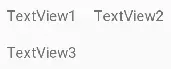
3.2 相对定位 相对定位是部件对于另一个位置的约束,这么说可能有点抽象,举个例子:
如图所示,TextView2在TextView1的右边,TextView3在TextView1的下面,这个时候在布局文件里面应该这样写:
1 2 3 4 5 6 7 8 9 10 11 12 13 14 <TextView android:id ="@+id/TextView1" ... android:text ="TextView1" /> <TextView android:id ="@+id/TextView2" ... app:layout_constraintLeft_toRightOf ="@+id/TextView1" /> <TextView android:id ="@+id/TextView3" ... app:layout_constraintTop_toBottomOf ="@+id/TextView1" />
上面代码中在TextView2里用到了app:layout_constraintLeft_toRightOf=”@+id/TextView1”这个属性,他的意思是把TextView2的左边约束到TextView1的右边,如下图所示:
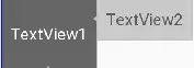
同理TextView3在TextView1的下面,就需要用到app:layout_constraintTop_toBottomOf=”@+id/TextView1”,即把TextView3的上面约束到TextView1的下面。
下面来看看相对定位的常用属性:
layout_constraintLeft_toLeftOf
layout_constraintLeft_toRightOf
layout_constraintRight_toLeftOf
layout_constraintRight_toRightOf
layout_constraintTop_toTopOf
layout_constraintTop_toBottomOf
layout_constraintBottom_toTopOf
layout_constraintBottom_toBottomOf
layout_constraintBaseline_toBaselineOf
layout_constraintStart_toEndOf
layout_constraintStart_toStartOf
layout_constraintEnd_toStartOf
layout_constraintEnd_toEndOf
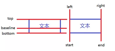
上面属性中有一个比较有趣的layout_constraintBaseline_toBaselineOfBaseline 指的是文本基线,举个例子:
如图所示,两个TextView的高度不一致,但是又希望他们文本对齐,这个时候就可以使用layout_constraintBaseline_toBaselineOf,代码如下:
1 2 3 4 5 6 7 8 9 <TextView android:id ="@+id/TextView1" ... /> <TextView android:id ="@+id/TextView2" ... app:layout_constraintLeft_toRightOf ="@+id/TextView1" app:layout_constraintBaseline_toBaselineOf ="@+id/TextView1" />
效果如下:
ConstraintLayout相对定位的用法跟RelativeLayout还是比较相似的,下面用一个图来总结相对定位:
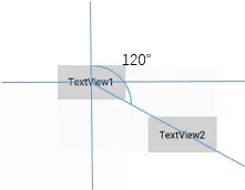
3.3 角度定位 角度定位指的是可以用一个角度和一个距离来约束两个空间的中心。举个例子:
1 2 3 4 5 6 7 8 9 10 11 12 <TextView android:id ="@+id/TextView1" android:layout_width ="wrap_content" android:layout_height ="wrap_content" /> <TextView android:id ="@+id/TextView2" android:layout_width ="wrap_content" android:layout_height ="wrap_content" app:layout_constraintCircle ="@+id/TextView1" app:layout_constraintCircleAngle ="120" app:layout_constraintCircleRadius ="150dp" />
上面例子中的TextView2用到了3个属性:
3.4 边距
ConstraintLayout的边距常用属性如下:
看起来跟别的布局没有什么差别,但实际上控件在ConstraintLayout里面要实现margin,必须先约束该控件在ConstraintLayout里的位置,举个例子:
1 2 3 4 5 6 7 8 9 10 11 12 <android.support.constraint.ConstraintLayout android:layout_width ="match_parent" android:layout_height ="match_parent" > <TextView android:id ="@+id/TextView1" android:layout_width ="wrap_content" android:layout_height ="wrap_content" android:layout_marginLeft ="10dp" android:layout_marginTop ="10dp" /> </android.support.constraint.ConstraintLayout >
如果在别的布局里,TextView1的位置应该是距离边框的左边和上面有一个10dp的边距,但是在ConstraintLayout里,是不生效的,因为没有约束TextView1在布局里的位置。正确的写法如下:
1 2 3 4 5 6 7 8 9 10 11 12 13 14 <android.support.constraint.ConstraintLayout android:layout_width ="match_parent" android:layout_height ="match_parent" > <TextView android:id ="@+id/TextView1" android:layout_width ="wrap_content" android:layout_height ="wrap_content" android:layout_marginLeft ="10dp" android:layout_marginTop ="10dp" app:layout_constraintLeft_toLeftOf ="parent" app:layout_constraintTop_toTopOf ="parent" /> </android.support.constraint.ConstraintLayout >
把TextView1的左边和上边约束到parent的左边和上边,这样margin就会生效,效果如下:
在使用margin的时候要注意两点:
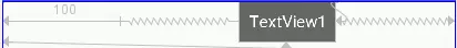
goneMargin主要用于约束的控件可见性被设置为gone的时候使用的margin值,属性如下:
举个例子:
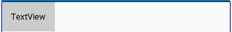
1 2 3 4 5 6 7 8 9 10 11 12 13 14 15 16 <android.support.constraint.ConstraintLayout android:layout_width ="match_parent" android:layout_height ="match_parent" > <TextView android:id ="@+id/TextView1" ... /> <TextView android:id ="@+id/TextView2" ... app:layout_constraintLeft_toRightOf ="@+id/TextView1" app:layout_goneMarginLeft ="10dp" /> </android.support.constraint.ConstraintLayout >
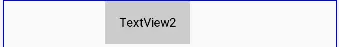
效果如下,TextView2在TextView1的右边,且没有边距。
这个时候把TextView1的可见性设为gone,效果如下:
TextView1消失后,TextView2有一个距离左边10dp的边距。
3.5 居中和偏移 在RelativeLayout中,把控件放在布局中间的方法是把layout_centerInParent设为true,而在ConstraintLayout中的写法是:
1 2 3 4 app:layout_constraintBottom_toBottomOf="parent" app:layout_constraintLeft_toLeftOf="parent" app:layout_constraintRight_toRightOf="parent" app:layout_constraintTop_toTopOf="parent"
意思是把控件的上下左右约束在布局的上下左右,这样就能把控件放在布局的中间了。同理RelativeLayout中的水平居中layout_centerHorizontal相当于在ConstraintLayout约束控件的左右为parent的左右;RelativeLayout中的垂直居中layout_centerVertical相当于在ConstraintLayout约束控件的上下为parent的上下。
1 2 3 4 5 6 <TextView android:id ="@+id/TextView1" ... android:layout_marginLeft ="100dp" app:layout_constraintLeft_toLeftOf ="parent" app:layout_constraintRight_toRightOf ="parent" />
效果如下:
上面TextView1在水平居中后使用layout_marginLeft=”100dp”向右偏移了100dp。除了这种偏移外,ConstraintLayout还提供了另外一种偏移的属性:
举个例子:
1 2 3 4 5 6 <TextView android:id ="@+id/TextView1" ... app:layout_constraintHorizontal_bias ="0.3" app:layout_constraintLeft_toLeftOf ="parent" app:layout_constraintRight_toRightOf ="parent" />
效果如下:
假如现在要实现水平偏移,给TextView1的layout_constraintHorizontal_bias赋一个范围为 0-1 的值,假如赋值为0,则TextView1在布局的最左侧,假如赋值为1,则TextView1在布局的最右侧,假如假如赋值为0.5,则水平居中,假如假如赋值为0.3,则更倾向于左侧。
3.6 尺寸约束 控件的尺寸可以通过四种不同方式指定:
使用指定的尺寸
使用wrap_content,让控件自己计算大小
使用 0dp (MATCH_CONSTRAINT)
1 2 3 4 5 6 7 8 <TextView android:id ="@+id/TextView1" android:layout_width ="0dp" android:layout_height ="wrap_content" android:layout_marginLeft ="50dp" app:layout_constraintLeft_toLeftOf ="parent" app:layout_constraintRight_toRightOf ="parent" android:visibility ="visible" />
宽度设为0dp,左右两边约束parent的左右两边,并设置左边边距为50dp,效果如下:
宽高比
1 2 3 4 5 6 7 <TextView android:id ="@+id/TextView1" android:layout_width ="0dp" android:layout_height ="wrap_content" app:layout_constraintDimensionRatio ="1:1" app:layout_constraintLeft_toLeftOf ="parent" app:layout_constraintRight_toRightOf ="parent" />
宽设置为0dp,宽高比设置为1:1,这个时候TextView1是一个正方形,效果如下:
除此之外,在设置宽高比的值的时候,还可以在前面加W或H,分别指定宽度或高度限制。 例如:
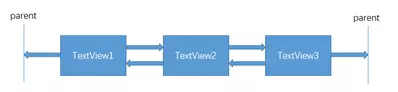
3.7 链 如果两个或以上控件通过下图的方式约束在一起,就可以认为是他们是一条链(图为横向的链,纵向同理)。
用代码表示:
1 2 3 4 5 6 7 8 9 10 11 12 13 14 15 16 17 18 19 20 21 <TextView android:id ="@+id/TextView1" android:layout_width ="wrap_content" android:layout_height ="wrap_content" app:layout_constraintLeft_toLeftOf ="parent" app:layout_constraintRight_toLeftOf ="@+id/TextView2" /> <TextView android:id ="@+id/TextView2" android:layout_width ="wrap_content" android:layout_height ="wrap_content" app:layout_constraintLeft_toRightOf ="@+id/TextView1" app:layout_constraintRight_toLeftOf ="@+id/TextView3" app:layout_constraintRight_toRightOf ="parent" /> <TextView android:id ="@+id/TextView3" android:layout_width ="wrap_content" android:layout_height ="wrap_content" app:layout_constraintLeft_toRightOf ="@+id/TextView2" app:layout_constraintRight_toRightOf ="parent" />
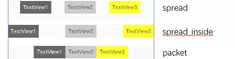
3个TextView相互约束,两端两个TextView分别与parent约束,成为一条链,效果如下:
一条链的第一个控件是这条链的链头,我们可以在链头中设置 layout_constraintHorizontal_chainStyle来改变整条链的样式。chains提供了3种样式,分别是:
上面的例子创建了一个样式链,除了样式链外,还可以创建一个权重链。
1 2 3 4 5 6 7 8 9 10 11 12 13 14 15 16 17 18 19 20 21 22 23 24 <TextView android:id ="@+id/TextView1" android:layout_width ="0dp" android:layout_height ="wrap_content" app:layout_constraintLeft_toLeftOf ="parent" app:layout_constraintRight_toLeftOf ="@+id/TextView2" app:layout_constraintHorizontal_weight ="2" /> <TextView android:id ="@+id/TextView2" android:layout_width ="0dp" android:layout_height ="wrap_content" app:layout_constraintLeft_toRightOf ="@+id/TextView1" app:layout_constraintRight_toLeftOf ="@+id/TextView3" app:layout_constraintRight_toRightOf ="parent" app:layout_constraintHorizontal_weight ="3" /> <TextView android:id ="@+id/TextView3" android:layout_width ="0dp" android:layout_height ="wrap_content" app:layout_constraintLeft_toRightOf ="@+id/TextView2" app:layout_constraintRight_toRightOf ="parent" app:layout_constraintHorizontal_weight ="4" />
效果如下:
4.辅助工具 4.1 Optimizer 当我们使用 MATCH_CONSTRAINT 时,ConstraintLayout 将对控件进行 2 次测量,ConstraintLayout在1.1中可以通过设置 layout_optimizationLevel 进行优化,可设置的值有:
4.2 Barrier
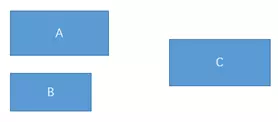
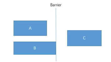
假设有3个控件ABC,C在AB的右边,但是AB的宽是不固定的,这个时候C无论约束在A的右边或者B的右边都不对。当出现这种情况可以用Barrier来解决。Barrier可以在多个控件的一侧建立一个屏障,如下所示:
这个时候C只要约束在Barrier的右边就可以了,代码如下:
1 2 3 4 5 6 7 8 9 10 11 12 13 14 15 16 17 18 19 20 21 22 23 <TextView android:id ="@+id/TextView1" android:layout_width ="wrap_content" android:layout_height ="wrap_content" /> <TextView android:id ="@+id/TextView2" android:layout_width ="wrap_content" android:layout_height ="wrap_content" app:layout_constraintTop_toBottomOf ="@+id/TextView1" /> <android.support.constraint.Barrier android:id ="@+id/barrier" android:layout_width ="wrap_content" android:layout_height ="wrap_content" app:barrierDirection ="right" app:constraint_referenced_ids ="TextView1,TextView2" /> <TextView android:id ="@+id/TextView3" android:layout_width ="wrap_content" android:layout_height ="wrap_content" app:layout_constraintLeft_toRightOf ="@+id/barrier" />
app:barrierDirection为屏障所在的位置,可设置的值有:bottom、end、left、right、start、top
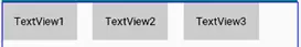
4.3 Group Group可以把多个控件归为一组,方便隐藏或显示一组控件,举个例子:
1 2 3 4 5 6 7 8 9 10 11 12 13 14 15 16 <TextView android:id ="@+id/TextView1" android:layout_width ="wrap_content" android:layout_height ="wrap_content" /> <TextView android:id ="@+id/TextView2" android:layout_width ="wrap_content" android:layout_height ="wrap_content" app:layout_constraintLeft_toRightOf ="@+id/TextView1" /> <TextView android:id ="@+id/TextView3" android:layout_width ="wrap_content" android:layout_height ="wrap_content" app:layout_constraintLeft_toRightOf ="@id/TextView2" />
现在有3个并排的TextView,用Group把TextView1和TextView3归为一组,再设置这组控件的可见性,如下所示:
1 2 3 4 5 6 <android.support.constraint.Group android:id ="@+id/group" android:layout_width ="wrap_content" android:layout_height ="wrap_content" android:visibility ="invisible" app:constraint_referenced_ids ="TextView1,TextView3" />
效果如下:
4.4 Placeholder Placeholder指的是占位符。在Placeholder中可使用setContent()设置另一个控件的id,使这个控件移动到占位符的位置。举个例子:
1 2 3 4 5 6 7 8 9 10 11 12 13 14 15 16 17 18 <android.support.constraint.Placeholder android:id ="@+id/placeholder" android:layout_width ="wrap_content" android:layout_height ="wrap_content" app:content ="@+id/textview" app:layout_constraintLeft_toLeftOf ="parent" app:layout_constraintTop_toTopOf ="parent" /> <TextView android:id ="@+id/textview" android:layout_width ="wrap_content" android:layout_height ="wrap_content" android:background ="#cccccc" android:padding ="16dp" android:text ="TextView" android:textColor ="#000000" app:layout_constraintRight_toRightOf ="parent" app:layout_constraintTop_toTopOf ="parent" />
新建一个Placeholder约束在屏幕的左上角,新建一个TextView约束在屏幕的右上角,在Placeholder中设置 app:content=”@+id/textview”,这时TextView会跑到屏幕的左上角。效果如下:
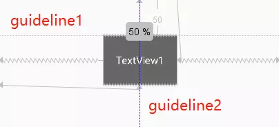
4.5 Guideline Guildline像辅助线一样,在预览的时候帮助你完成布局(不会显示在界面上)。
1 2 3 4 5 6 7 8 9 10 11 12 13 <android.support.constraint.Guideline android:id ="@+id/guideline1" android:layout_width ="wrap_content" android:layout_height ="wrap_content" android:orientation ="horizontal" app:layout_constraintGuide_begin ="50dp" /> <android.support.constraint.Guideline android:id ="@+id/guideline2" android:layout_width ="wrap_content" android:layout_height ="wrap_content" android:orientation ="vertical" app:layout_constraintGuide_percent ="0.5" />
guideline1为水平辅助线,开始位置是距离顶部50dp,guideline2位垂直辅助线,开始位置为屏幕宽的0.5(中点位置),效果如下:
其他文章:https://www.jianshu.com/p/958887ed4f5f
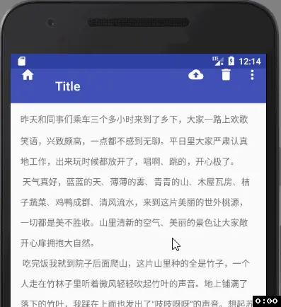
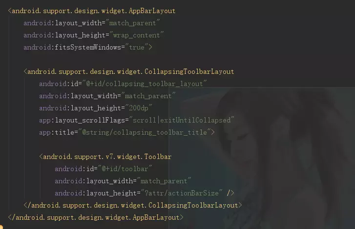
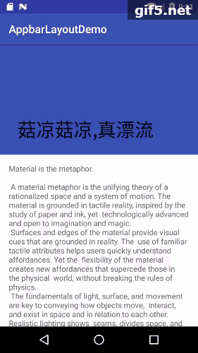
2、AppbarLayout控件 AppbarLayout是Material Design的一个控件,目的是为了实现一些酷炫到爆的效果,比如之前的折叠导航栏可以费劲心血的写出来,现在利用Appbarlayout非常容易的就可以实现出来,当然需要配合其他几个来控件实现。
用法: 实现toolbar的收缩和扩展需要用到:
CoordinatorLayout 和AppbarLayout 的配合, 以及实现了NestedScrollView 的布局或控件.AppbarLayout是一种支持响应滚动手势的app bar布局, CollapsingToolbarLayout则是专门用来实现子布局内不同元素响应滚动细节的布局.
与AppbarLayout组合的滚动布局(RecyclerView, NestedScrollView等),需要设置 app:layout_behavior = “@string/appbar_scrolling_view_behavior” .没有设置的话, AppbarLayout将不会响应滚动布局的滚动事件.
例如:
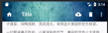
1
2
3
4
5
6
7
8
9
10
11
12
13
14
15
16
17
18
19
20
21
22
23
24
25
26
27
28
29
30
31
32
33
34
35
<?xml version="1.0" encoding="utf-8" ?> <android.support.design.widget.CoordinatorLayout xmlns:android ="http://schemas.android.com/apk/res/android" xmlns:app ="http://schemas.android.com/apk/res-auto" xmlns:tools ="http://schemas.android.com/tools" android:layout_width ="match_parent" android:layout_height ="match_parent" tools:context ="com.truly.mytoolbar.MainActivity" > <android.support.design.widget.AppBarLayout android:layout_width ="match_parent" android:layout_height ="wrap_content" > <android.support.v7.widget.Toolbar android:id ="@+id/toolbar" android:layout_width ="match_parent" android:layout_height ="?attr/actionBarSize" android:background ="?attr/colorPrimary" android:theme ="@style/ThemeOverlay.AppCompat.Dark.ActionBar" app:layout_scrollFlags ="scroll" app:popupTheme ="@style/ThemeOverlay.AppCompat.Light" app:title ="Title" /> </android.support.design.widget.AppBarLayout > <android.support.v4.widget.NestedScrollView android:layout_width ="match_parent" android:layout_height ="match_parent" app:layout_behavior ="@string/appbar_scrolling_view_behavior" > <TextView android:id ="@+id/tv_content" android:layout_margin ="16dp" android:layout_width ="match_parent" android:layout_height ="match_parent" android:lineSpacingMultiplier ="2" android:text ="@string/textContent" /> </android.support.v4.widget.NestedScrollView > </android.support.design.widget.CoordinatorLayout >
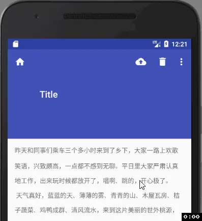
先看下效果再来解释为什么.
可以看到:
随着文本往上滚动, 顶部的toolbar也往上滚动, 直到消失.
随着文本往下滚动, 一直滚到文本的第一行露出来, toolbar也逐渐露出来
解释:
AppbarLayout
NestedScrollView
AppBarLayout 继承自LinearLayout,布局方向为垂直方向。所以你可以把它当成垂直布局的LinearLayout来使用。AppBarLayout是在LinearLayou上加了一些材料设计的概念,它可以让你定制当某个可滚动View的滚动手势发生变化时,其内部的子View实现何种动作。
【CoordinatorLayout允许behavior协调子view】
注意:
上面提到的”某个可滚动View”, 可以理解为某个ScrollView. 就是说,当某个ScrollView发生滚动时,你可以定制你的“顶部栏”应该执行哪些动作(如跟着一起滚动、保持不动等等)。
这里某个ScrollView就是NestedScrollView或者实现了NestedScrollView机制的其它控件, 如RecyclerView. 它有一个布局行为Layout_Behavior:
1 app:layout_behavior="@string/appbar_scrolling_view_behavior"
这是一个系统behavior, 从字面意思就可以看到, 是为appbar设置滚动动作的一个behavior. 没有这个属性的话, Appbar就是死的, 有了它就有了灵魂.
我们可以通过给Appbar下的子View添加app:layout_scrollFlags 来设置各子View执行的动作. scrollFlags可以设置的动作如下:
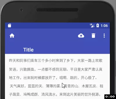
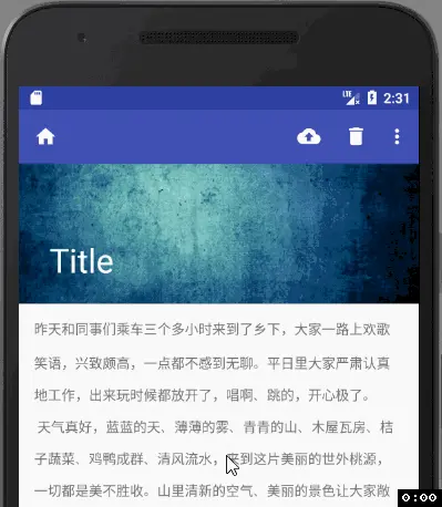
(1) scroll: 值设为scroll的View会跟随滚动事件一起发生移动。就是当指定的ScrollView发生滚动时,该View也跟随一起滚动,就好像这个View也是属于这个ScrollView一样。
上面这个效果就是设置了scroll之后的.
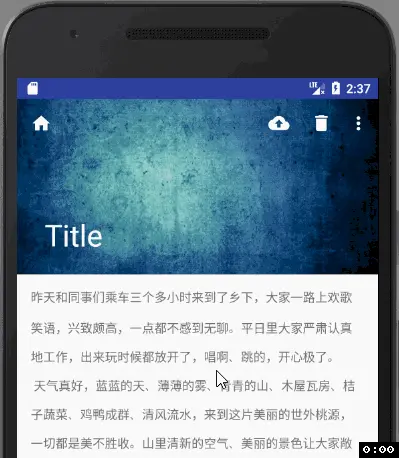
(2) enterAlways: 值设为enterAlways的View,当任何时候ScrollView往下滚动时,该View会直接往下滚动。而不用考虑ScrollView是否在滚动到最顶部还是哪里.
我们把layout_scrollFlags改动如下:
1 app:layout_scrollFlags="scroll|enterAlways"
效果如下:
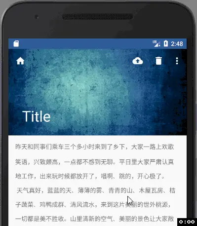
(3) exitUntilCollapsed:值设为exitUntilCollapsed的View,当这个View要往上逐渐“消逝”时,会一直往上滑动,直到剩下的的高度达到它的最小高度后,再响应ScrollView的内部滑动事件。
怎么理解呢?简单解释:在ScrollView往上滑动时,首先是View把滑动事件“夺走”,由View去执行滑动,直到滑动最小高度后,把这个滑动事件“还”回去,让ScrollView内部去上滑。
把属性改下再看效果
1 2 3 4 5 6 <android.support.v7.widget.Toolbar ... android:layout_height ="?attr/actionBarSize" android:minHeight ="20dp" app:layout_scrollFlags ="scroll|exitUntilCollapsed" />
(4) enterAlwaysCollapsed:是enterAlways的附加选项,一般跟enterAlways一起使用,它是指,View在往下“出现”的时候,首先是enterAlways效果,当View的高度达到最小高度时,View就暂时不去往下滚动,直到ScrollView滑动到顶部不再滑动时,View再继续往下滑动,直到滑到View的顶部结束
这个得把高度加大点才好实验. 来看:
1
2
3
4
5
6
<android.support.v7.widget.Toolbar ... android:layout_height="200dp" android:minHeight="?attr/actionBarSize" app:layout_scrollFlags="scroll|enterAlways|enterAlwaysCollapsed" </android.support.design.widget.AppBarLayout>
Attention:
其实toolbar的默认最小高度minHeight就是"?attr/actionBarSize" , 很多时候可以不用设置. 而且从图上可以看出, 其实这里有个缺陷, 就是title的位置和toolbar上的图标行脱离了, 即使在布局里添加了 android:gravity="bottom|start", 在toolbar滚动的时候, title还在, 图标滚动到隐藏了.
后面讲解的CollapsingToolbarLayout可以解决这个问题, 这里先丢出来.
(5) snap:简单理解,就是Child View滚动比例的一个吸附效果。也就是说,Child View不会存在局部显示的情况,滚动Child View的部分高度,当我们松开手指时,Child View要么向上全部滚出屏幕,要么向下全部滚进屏幕,有点类似ViewPager的左右滑动
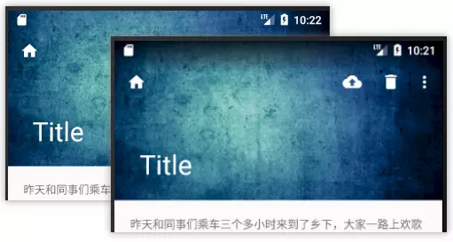
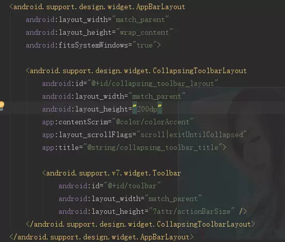
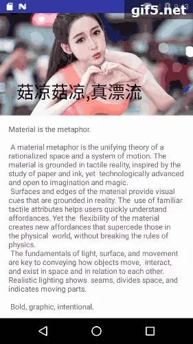
CollapsingToolbarLayout是用来对Toolbar进行再次包装的ViewGroup,主要是用于实现折叠(其实就是看起来像伸缩)的App Bar效果。它需要放在AppBarLayout布局里面,并且作为AppBarLayout的直接子。CollapsingToolbarLayout主要包括几个功能(参照了官方网站上内容,略加自己的理解进行解释):
(1) 折叠Title(Collapsing title):当布局内容全部显示出来时,title是最大的,但是随着View逐步移出屏幕顶部,title变得越来越小。你可以通过调用setTitle方法来设置title。
(2)内容纱布(Content scrim):根据滚动的位置是否到达一个阀值,来决定是否对View“盖上纱布”。可以通过setContentScrim(Drawable)来设置纱布的图片. 默认contentScrim是colorPrimary的色值
(3)状态栏纱布(Status bar scrim):根据滚动位置是否到达一个阀值决定是否对状态栏“盖上纱布”,你可以通过setStatusBarScrim(Drawable)来设置纱布图片,但是只能在LOLLIPOP设备上面有作用。默认statusBarScrim是colorPrimaryDark的色值.
(4)视差滚动子View(Parallax scrolling children): 子View可以选择在当前的布局当时是否以“视差”的方式来跟随滚动。(PS:其实就是让这个View的滚动的速度比其他正常滚动的View速度稍微慢一点)。将布局参数app:layout_collapseMode设为parallax
(5)将子View位置固定(Pinned position children):子View可以选择是否在全局空间上固定位置,这对于Toolbar来说非常有用,因为当布局在移动时,可以将Toolbar固定位置而不受移动的影响。 将app:layout_collapseMode设为pin。
我们来更改一下布局:
1
2
3
4
5
6
7
8
9
10
11
12
13
14
15
16
17
18
19
20
21
22
23
24
25
26
27
28
29
30
31
32
33
34
35
36
37
38
39
40
41
42
<?xml version="1.0" encoding="utf-8" ?> <android.support.design.widget.CoordinatorLayout ... > <android.support.design.widget.AppBarLayout android:layout_width ="match_parent" android:layout_height ="150dp" > <android.support.design.widget.CollapsingToolbarLayout android:id ="@+id/collapsing_toolbar_layout" android:layout_width ="match_parent" android:layout_height ="match_parent" android:theme ="@style/ThemeOverlay.AppCompat.Dark.ActionBar" app:layout_scrollFlags ="scroll|exitUntilCollapsed" > <android.support.v7.widget.Toolbar android:id ="@+id/toolbar" android:layout_width ="match_parent" android:layout_height ="?attr/actionBarSize" android:background ="?attr/colorPrimary" app:layout_collapseMode ="parallax" app:popupTheme ="@style/ThemeOverlay.AppCompat.Light" app:title ="Title" /> </android.support.design.widget.CollapsingToolbarLayout > </android.support.design.widget.AppBarLayout > <android.support.v4.widget.NestedScrollView android:layout_width ="match_parent" android:layout_height ="match_parent" app:layout_behavior ="@string/appbar_scrolling_view_behavior" > <TextView android:id ="@+id/tv_content" android:layout_width ="match_parent" android:layout_height ="match_parent" android:layout_margin ="16dp" android:lineSpacingMultiplier ="2" android:text ="@string/textContent" /> </android.support.v4.widget.NestedScrollView > </android.support.design.widget.CoordinatorLayout >
可以看到, 我们把原本属于toolbar的几个属性移到了CollapsingToolbarLayout上. 分别是:
1
2
android:theme="@style/ThemeOverlay.AppCompat.Dark.ActionBar" app:layout_scrollFlags="scroll|exitUntilCollapsed"
同时给toolbar增加了一个折叠模式属性
1 app:layout_collapseMode="parallax"
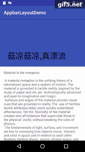
我们来看下效果:
嗯嗯, 折叠模式不对, toolbar的顶部图标没了. 我们改下折叠模式:
1 app:layout_collapseMode="pin"
再看效果:
我们把scrollFlags属性改下, 看下对比:
1 app:layout_scrollFlags="scroll|enterAlways|enterAlwaysCollapsed"
效果还是蛮不错的, 有了点Google Material Design的感觉了.
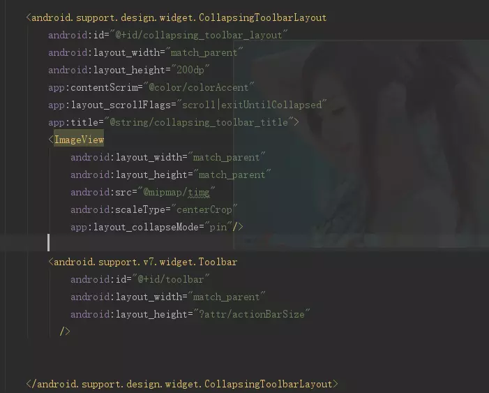
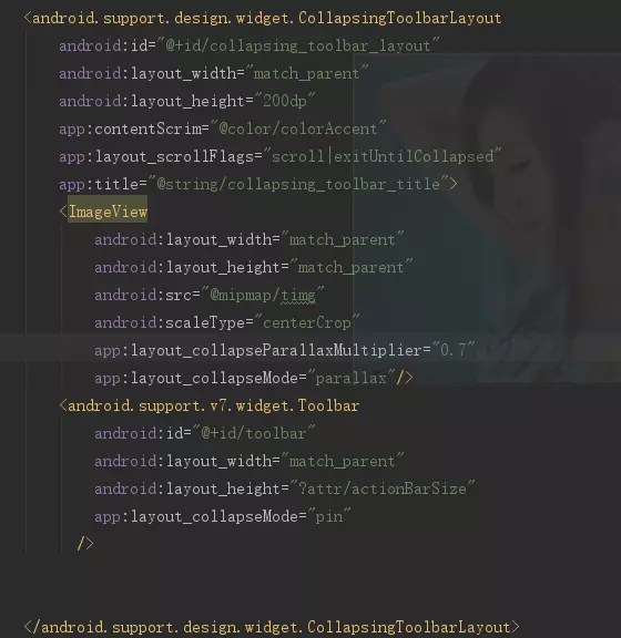
上面说CollapsingToolbarLayout是个ViewGroup, 那么肯定还可以添加控件. 那么我们在里面添加一个ImageView来看看. 更改布局如下:
1
2
3
4
5
6
7
8
9
10
11
12
13
14
15
16
17
18
19
20
21
22
23
24
25
26
27
28
29
30
31
32
33
34
35
<?xml version="1.0" encoding="utf-8" ?> <android.support.design.widget.CoordinatorLayout ... > <android.support.design.widget.AppBarLayout android:layout_width ="match_parent" android:layout_height ="200dp" > <android.support.design.widget.CollapsingToolbarLayout ... android:theme ="@style/ThemeOverlay.AppCompat.Dark.ActionBar" app:layout_scrollFlags ="scroll|enterAlways|enterAlwaysCollapsed" > <ImageView android:layout_width ="match_parent" android:layout_height ="match_parent" android:scaleType ="centerCrop" android:src ="@drawable/darkbg" app:layout_collapseMode ="parallax" /> <android.support.v7.widget.Toolbar android:id ="@+id/toolbar" android:layout_width ="match_parent" android:layout_height ="?attr/actionBarSize" android:background ="?attr/colorPrimary" app:layout_collapseMode ="pin" app:popupTheme ="@style/ThemeOverlay.AppCompat.Light" app:title ="Title" /> </android.support.design.widget.CollapsingToolbarLayout > </android.support.design.widget.AppBarLayout > <android.support.v4.widget.NestedScrollView ... app:layout_behavior ="@string/appbar_scrolling_view_behavior" > <TextView ... /> </android.support.v4.widget.NestedScrollView > </android.support.design.widget.CoordinatorLayout >
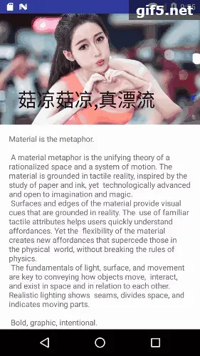
来看下效果:
嗯, 有了点意思, 但不美观, 上部的toolbar和图片不协调. toolbar应该有默认的背景属性, 我们去掉它看看.
1 2 3 4 5 6 7 <android.support.v7.widget.Toolbar android:id ="@+id/toolbar" android:layout_width ="match_parent" android:layout_height ="?attr/actionBarSize" app:layout_collapseMode ="pin" app:popupTheme ="@style/ThemeOverlay.AppCompat.Light" app:title ="Title" />
再看下效果:
这次真的不错哦, 已经和很多大公司的app相像了. 但是为什么去掉toolbar的background就可以得到透明背景呢? 说句实话, 没找到原因.
不过我们没有给CollapsingToolbarLayout设置contentScrim属性哦, 给它加个属性看看.
1 2 3 4 <android.support.design.widget.CollapsingToolbarLayout ... app:contentScrim ="?attr/colorPrimary" ... >
嗯嗯, 好像还不如没设置这个属性好呢.
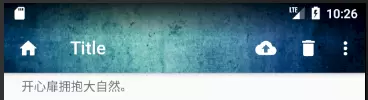
什么时候需要contentScrim属性呢? layout_scrollFlags设置的是 "scroll|enterAlways|enterAlwaysCollapsed" , toolbar会全部消失的, 所以感觉不是很美观. 如果将layout_scrollFlags属性改为 “scroll|exitUntilCollapsed” , 效果会好点, 适合toolbar还是需要展示的场合.
不管怎么样, 先去掉contentScrim属性吧.
目前有很多APP比较喜欢采用沉浸式设计, 简单点说就是将状态栏和导航栏都设置成透明或半透明的.
我们来把状态栏statusBar设置成透明. 在style主题中的AppTheme里增加一条:
1 2 3 4 5 <style name ="AppTheme" parent ="Theme.AppCompat.Light.NoActionBar" > ... <item name ="android:statusBarColor" > @android:color/transparent</item > </style >
在布局里面, 将ImageView和所有它上面的父View都添加fitsSystemWindows属性.
1
2
3
4
5
6
7
8
9
10
11
12
13
14
15
16
17
18
19
20
21
22
23
24
25
26
<?xml version="1.0" encoding="utf-8" ?> <android.support.design.widget.CoordinatorLayout ... android:fitsSystemWindows ="true" > <android.support.design.widget.AppBarLayout ... android:fitsSystemWindows ="true" > <android.support.design.widget.CollapsingToolbarLayout ... android:fitsSystemWindows ="true" > <ImageView ... android:fitsSystemWindows ="true" /> <android.support.v7.widget.Toolbar ... /> </android.support.design.widget.CollapsingToolbarLayout > </android.support.design.widget.AppBarLayout > <android.support.v4.widget.NestedScrollView ... > <TextView ... /> </android.support.v4.widget.NestedScrollView > </android.support.design.widget.CoordinatorLayout >
最后来看下效果:
其实还可以在CollapsingToolbarLayout里设置statusBarScrim为透明色, 不过有点问题, 最顶部的toolbar没有完全隐藏, 还留了一点尾巴.
难道就这个属性就没用吗? 我们把layout_scrollFlags改成 “scroll|exitUntilCollapsed” 看看:
这个时候toolbar不用隐藏, 所以还是美美的.
AppbarLayout整个做成沉浸式之后, 状态栏的图标可能会受到封面图片颜色过浅的影响, 可以给其加一个渐变的不透明层.
渐变遮罩 设置方法:
在res/drawable文件夹下新建一个名为status_gradient的xml资源文件, 代码如下:
1
2
3
4
5
6
7
8
9
10
<?xml version="1.0" encoding="utf-8" ?> <shape xmlns:android ="http://schemas.android.com/apk/res/android" > <gradient android:angle ="270" android:endColor ="@android:color/transparent" android:startColor ="#CC000000" /> </shape >
布局中, 在ImageView下面增加一个View, 背景设为上面的渐变遮罩.
1 2 3 4 5 6 7 <View android:layout_width ="match_parent" android:layout_height ="40dp" android:background ="@drawable/status_gradient" app:layout_collapseMode ="pin" android:fitsSystemWindows ="true" />
给遮罩设置折叠模式: app:layout_collapseMode=”pin” , 折叠到顶部后定住. 来看下效果.
上图是展开状态的对比, 后面的是没有添加遮罩的效果, 前面是添加了遮罩的效果. 下图是添加了遮罩折叠后的效果. 有点黑暗系影片的感觉哦.
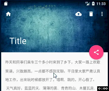
作为Google Material Design的一个重要控件, FloatingActionButton怎么可能不在AppbarLayout中起点作用呢. 我们在布局中加一个悬浮按钮, 让它的锚点挂载Appbar的右下角. 这样这个悬浮按钮就和Appbar关联起来了.
1 2 3 4 5 6 7 8 9 10 11 12 13 14 15 16 17 18 19 20 21 22 23 24 <android.support.design.widget.CoordinatorLayout ... > <android.support.design.widget.AppBarLayout ... </android.support.design.widget.AppBarLayout > <android.support.v4.widget.NestedScrollView ... </android.support.v4.widget.NestedScrollView > <android.support.design.widget.FloatingActionButton android:id ="@+id/fab" android:layout_width ="wrap_content" android:layout_height ="wrap_content" android:layout_margin ="16dp" android:src ="@drawable/ic_share_white_24dp" android:elevation ="4dp" app:pressedTranslationZ ="16dp" app:rippleColor ="@android:color/white" app:layout_anchor ="@id/appbar" app:layout_anchorGravity ="bottom|end" /> </android.support.design.widget.CoordinatorLayout >
我们来看下效果.
好吧, 美美的Toolbar完成了, 有点Google Material Design扑面而来的感觉了
使用FloatingActionButton其实非常简单只需要在布局文件中引入控件即可,不过它的属性有点多,我们先来介绍一下它的属性。
android:src:FAB中显示的图标.
app:backgroundTint:正常的背景颜色 ,这里是ColorStateList类型
app:rippleColor:按下时的背景颜色
app:elevation:正常的阴影大小
app:pressedTranslationZ:按下时的阴影大小
app:layout_anchor:设置FAB的锚点,即以哪个控件为参照设置位置
app:layout_anchorGravity:FAB相对于锚点的位置
app:fabSize:FAB的大小,normal或mini(分别对应56dp和40dp)
app:borderWidth:边框大小,最好设置成0dp否则会有边框
android:clickable:一定要设置成true否则没有点击效果
其他方法介绍
addOnOffsetChangedListener 当AppbarLayout 的偏移发生改变的时候回调,也就是子View滑动。
getTotalScrollRange 返回AppbarLayout 所有子View的滑动范围
removeOnOffsetChangedListener 移除监听器
**setExpanded (boolean expanded, boolean animate)**设置AppbarLayout 是展开状态还是折叠状态,animate 参数控制切换到新的状态时是否需要动画
**setExpanded (boolean expanded)**设置AppbarLayout 是展开状态还是折叠状态,默认有动画
但看解释好像不明白,我们详细来看一下这几个方法
1,addOnOffsetChangedListener
这是官方的解释,其实很明白了
Called when theAppBarLayout’s layout offset has been changed. This allows child views to implement custom behavior based on the offset (for instance pinning a view at a certain y value).
在AppBarLayout 的布局偏移量发生改变时被调用。这个方法允许子view根据偏移量实现自定义的行为(比如在特定Y值的时候固定住一个View)
下面来举个例子来看一下这个方法能作甚们
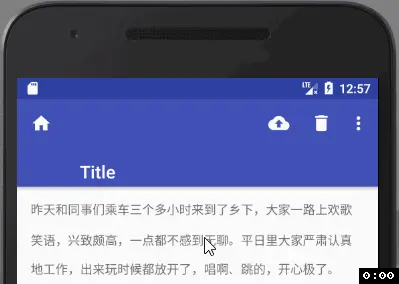
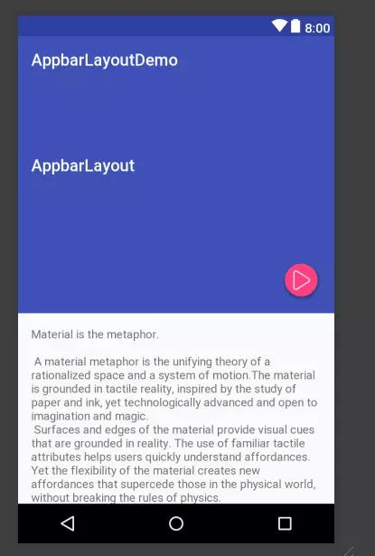
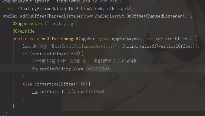
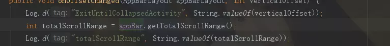
如图我们搞一个这个样子的布局
布局:
java代码:
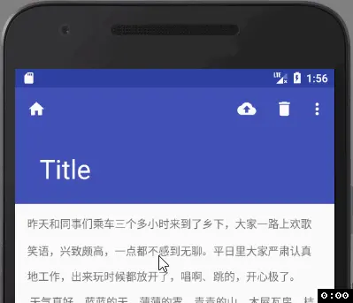
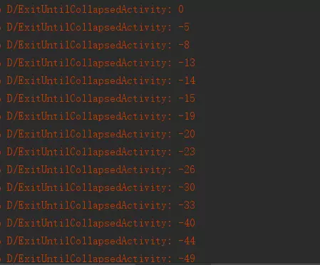
日志:
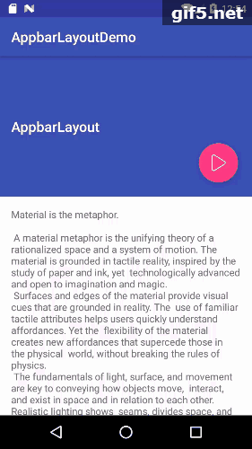
可见当appbarlayout最大的时候偏移量为0,网上滑动的时候,偏移量向负数方向增大,下面是效果图,只是展示了可以做的一些事情,实际项目中可以根据偏移量随意操作,比如可以做个透明度的动画等等
效果图:
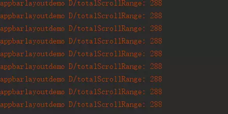
2,getTotalScrollRange,这个方法返货的是一个滑动的范围,也可以理解为党appbarlayout滑动到最小值时候的一个值得绝对值,这个值是不变的,是以appbarlayout为基础的其所有子view的一个范围值,如下,我们在addOnOffsetChangedListener方法中加入以下代码,然后滑动得到的值全都是288。有这个方法,我们可以在addOnOffsetChangedListener方法中做什么事情之前做一个精准的判断。
3,removeOnOffsetChangedListener ,移除监听器,这个没什么好说的,移除掉偏移量监听,某些情况下,你可能需要根据偏移量做些神门事情,但是某些情况下,你有不想做神门,所以只好把他移除掉。
4,setExpanded (boolean expanded, boolean animate)设置AppbarLayout 是展开状态还是折叠状态,animate 参数控制切换到新的状态时是否需要动画
setExpanded (boolean expanded)设置AppbarLayout 是展开状态还是折叠状态,默认有动画
这俩个方法,就像他的解释一样
false为关闭状态,true为展开状态
打开时的状态:
CollapsingToolbarLayout是对子view的包装,并且实现了折叠app bar效果,使用时,要作为 AppbarLayout 的直接子View。
1,Collapsing title(折叠标题)当布局全部可见的时候,title 是最大的,当布局开始滑出屏幕,title 将变得越来越小,你可以通过setTitle(CharSequence) 来设置要显示的标题。
注意:Toolbar 和CollapsingToolbarLayout 同时设置了title时,不会显示Toolbartitle而是显示CollapsingToolbarLayout 的title,如果要显示Toolbar 的title,你可一在代码中添加如下代码:
collapsingToolbarLayout.setTitle(“”)
注意:你得给CollapsingToolbarLayout设置一个值,你来个wrap_parent是不起作用的,或者你把toolbar设置一个值来撑大CollapsingToolbarLayout也是不可以的
布局:
效果图:
2,Content scrim(内容纱布)当CollapsingToolbarLayout滑动到一个确定的阀值时将显示或者隐藏内容纱布,可以通过setContentScrim(Drawable)来设置纱布的图片。
布局:
效果图:
3,Status bar scrim(状态栏纱布)当CollapsingToolbarLayout滑动到一个确定的阀值时,状态栏显示或隐藏纱布,你可以通过setStatusBarScrim(Drawable)来设置纱布图片。
4,Pinned position children(固定子View的位置)子View可以固定在全局空间内,这对于实现了折叠并且允许通过滚动布局来固定Toolbar 这种情况非常有用。在xml 中将collapseMode设为pin
布局:
效果图:
5,Parallax scrolling children(有视差地滚动子View)让CollapsingToolbarLayout 的子View 可以有视差的滚动,需要在xml中用 添加如下代码:
app:layout_collapseMode=”parallax”
注意:app:layout_collapseParallaxMultiplier=”0.7” 这个参数是设置视差范围的,0-1,越大视差越大
布局:
效果图:
以上就是appbarlayout的全部特点,在项目中使用几次就会了,各种scrollFlag与CollapsingToolbarLayout的搭配使用,可以做出很多非常酷炫的效果,基本满足各种需求,如果设计师太鬼畜,那么打她,打她,打她!!!!!!! 打不过?请用behavior,behavior,.behavior!!!
3、DrawerLayout抽屉布局 参照:https://blog.csdn.net/crazy1235/article/details/41696291
1、介绍 导航抽屉显示在屏幕的最左侧,默认情况下是隐藏的,当用户用手指从边缘向另一个滑动的时候,会出现一个隐藏的面板,当点击面板外部或者向原来的方向滑动的时候,抽屉导航就会消失了!android.support.v4.widget.DrawerLayout.
2、使用
抽屉导航的实现步骤非常简单。只要配置好带有抽屉导航的布局就可以实现简单的策划菜单。布局代码如下:
1 2 3 4 5 6 7 8 9 10 11 12 13 14 15 16 17 18 19 20 21 22 23 24 25 26 27 28 29 30 31 <android.support.v4.widget.DrawerLayout xmlns:android ="http://schemas.android.com/apk/res/android" xmlns:tools ="http://schemas.android.com/tools" android:id ="@+id/id_drawerlayout" android:layout_width ="match_parent" android:layout_height ="match_parent" > <FrameLayout android:id ="@+id/id_framelayout" android:layout_width ="match_parent" android:layout_height ="match_parent" > <Button android:id ="@+id/id_btn1" android:layout_width ="wrap_content" android:layout_height ="wrap_content" android:text ="1111" /> </FrameLayout > <LinearLayout android:id ="@+id/id_drawer" android:layout_width ="240dp" android:layout_height ="match_parent" android:layout_gravity ="start" android:background ="#E0EEE0" android:orientation ="vertical" > <ListView android:id ="@+id/id_lv" android:layout_width ="wrap_content" android:layout_height ="wrap_content" android:divider ="#CD853F" android:dividerHeight ="2dp" > </ListView > </LinearLayout > </android.support.v4.widget.DrawerLayout >
说明:
必须把DrawerLayout作为布局的跟标签。
然后在跟标签中添加一个包含内容的视图,就是当抽屉完全隐藏的时候显示的内容布局。
添加一个抽屉布局,这个布局可以按照需求自己定义,我的demo中是一个listview。
抽屉布局中,需要指定android:layout_gravity属性,官方说明是用start代替left。不过我试了一下start和left,right和end的效果是一样的。知道是什么区别?(谁知道,请留言告知一下!谢谢!)
抽屉布局的宽度最好不要超过320dp,这样做为了当抽屉完全显示的时候,不至于把内容布局全部遮挡。
好了,此时在你的activity中设置一下布局文件,就可以实现一个简单的侧滑菜单了,不过菜单是在上面的。
初始化listview
接下来,就要初始化listview了。
1
2
3
4
5
6
mLv = (ListView) findViewById(R.id.id_lv); str = new String [] { "item1" , "item2" , "item3" }; ArrayAdapter<String> adapter = new ArrayAdapter <String>(this , android.R.layout.simple_list_item_1, str); mLv.setAdapter(adapter); mLv.setOnItemClickListener(this );
下面,设置抽屉导航的监听事件。添加监听器的时候有三种方式 。
1、设置DrawerLayout.DrawerListener作为监听器类,里面包含四个回调函数。
代码如下:
1 2 3 4 5 6 7 8 9 10 11 12 13 14 15 16 17 18 19 20 21 22 23 24 25 26 27 28 29 30 31 32 33 mDrawerLayout.setDrawerListener(new DrawerListener () { @Override public void onDrawerStateChanged (int arg0) { Log.i("drawer" , "drawer的状态:" + arg0); } @Override public void onDrawerSlide (View arg0, float arg1) { Log.i("drawer" , arg1 + "" ); } @Override public void onDrawerOpened (View arg0) { Log.i("drawer" , "抽屉被完全打开了!" ); } @Override public void onDrawerClosed (View arg0) { Log.i("drawer" , "抽屉被完全关闭了!" ); } });
2、设置DrawerListener的子类SimpleDrawerListener,使用这个类的时候不必实现全部的回调函数,可以根据自己的需要重写相应的方法。
代码如下:
1 2 3 4 5 6 7 8 9 10 mDrawerLayout.setDrawerListener(new DrawerLayout .SimpleDrawerListener() { @Override public void onDrawerClosed (View drawerView) { super .onDrawerClosed(drawerView); } @Override public void onDrawerOpened (View drawerView) { super .onDrawerOpened(drawerView); } });
3、使用DrawerListener的子类ActionBarDrawerToggle。一般与ActionBar结合使用。
代码如下:
1
2
3
4
5
6
7
8
9
10
11
12
13
14
15
mDrawerToggle = new ActionBarDrawerToggle (this , mDrawerLayout, R.drawable.ic_drawer, R.string.drawer_open, R.string.drawer_close) { @Override public void onDrawerClosed (View drawerView) { getActionBar().setTitle(mTitle); invalidateOptionsMenu(); } @Override public void onDrawerOpened (View drawerView) { getActionBar().setTitle(mDrawerTitle); invalidateOptionsMenu(); } }; mDrawerLayout.setDrawerListener(mDrawerToggle);
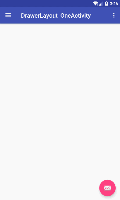
DrawerLayout和NavigationView使用(重点) (一)基本使用 DrawerLayout界面
1
2
3
4
5
6
7
8
9
10
11
12
13
14
15
16
17
18
19
20
21
22
23
24
25
26
<?xml version="1.0" encoding="utf-8" ?> <android.support.v4.widget.DrawerLayout android:id ="@+id/drawer_layout" xmlns:android ="http://schemas.android.com/apk/res/android" xmlns:app ="http://schemas.android.com/apk/res-auto" xmlns:tools ="http://schemas.android.com/tools" android:layout_width ="match_parent" android:layout_height ="match_parent" android:fitsSystemWindows ="true" tools:openDrawer ="start" > <include layout ="@layout/app_bar_drawer_layout__one" android:layout_width ="match_parent" android:layout_height ="match_parent" /> <android.support.design.widget.NavigationView android:id ="@+id/nav_view" android:layout_width ="wrap_content" android:layout_height ="match_parent" android:layout_gravity ="start" android:fitsSystemWindows ="true" app:headerLayout ="@layout/nav_header_drawer_layout__one" app:menu ="@menu/activity_drawer_layout__one_drawer" /> </android.support.v4.widget.DrawerLayout >
可以看到我们的最外层是DrawerLayout,包含了两个内容:include为显示内容区域,NavigationView为侧边抽屉栏。
NavigationView有两个app属性,分别为app:headerLayout和app:menu,headerLayout用于显示头部的布局(可选),menu用于建立MenuItem选项的菜单。
headerLayout就是正常的layout布局文件,我们查看下menu.xml
1
2
3
4
5
6
7
8
9
10
11
12
13
14
15
16
17
18
19
20
21
22
23
24
25
26
27
28
29
30
31
32
33
34
35
<?xml version="1.0" encoding="utf-8" ?> <menu xmlns:android ="http://schemas.android.com/apk/res/android" > <group android:checkableBehavior ="single" > <item android:id ="@+id/nav_camera" android:icon ="@drawable/ic_menu_camera" android:title ="Import" /> <item android:id ="@+id/nav_gallery" android:icon ="@drawable/ic_menu_gallery" android:title ="Gallery" /> <item android:id ="@+id/nav_slideshow" android:icon ="@drawable/ic_menu_slideshow" android:title ="Slideshow" /> <item android:id ="@+id/nav_manage" android:icon ="@drawable/ic_menu_manage" android:title ="Tools" /> </group > <item android:title ="Communicate" > <menu > <item android:id ="@+id/nav_share" android:icon ="@drawable/ic_menu_share" android:title ="Share" /> <item android:id ="@+id/nav_send" android:icon ="@drawable/ic_menu_send" android:title ="Send" /> </menu > </item > </menu >
menu可以分组,group的android:checkableBehavior属性设置为single可以设置该组为单选
Activity主题必须设置先这两个属性
1 2 3 4 <style name ="AppTheme.NoActionBar" > <item name ="windowActionBar" > false</item > <item name ="windowNoTitle" > true</item > </style >
未设置Activity主题会爆出错误信息:
1
2
3
4
vCaused by : java.lang.IllegalStateException: This Activity already has an action bar supplied by the window decor. Do not request Window.FEATURE_SUPPORT_ACTION_BAR and set windowActionBar to false in your theme to use a Toolbar instead.
设置主题为android:theme=”@style/AppTheme.NoActionBar”
效果图:
(二)、监听和关闭NavigationView NavigationView监听通过navigationView.setNavigationItemSelectedListener(this)方法去监听menu的点击事件
1
2
3
4
5
6
7
8
9
10
@SuppressWarnings("StatementWithEmptyBody") @Override public boolean onNavigationItemSelected (MenuItem item) { int id = item.getItemId(); DrawerLayout drawer = (DrawerLayout) findViewById(R.id.drawer_layout); drawer.closeDrawer(GravityCompat.START); return true ; }
每次点击一个Menu关闭DrawerLayout,方法为drawer.closeDrawer(GravityCompat.START);
通过onBackPressed方法,当点击返回按钮的时候,如果DrawerLayout是打开状态则关闭
1
2
3
4
5
6
7
8
9
10
@Override public void onBackPressed () { DrawerLayout drawer = (DrawerLayout) findViewById(R.id.drawer_layout); if (drawer.isDrawerOpen(GravityCompat.START)) { drawer.closeDrawer(GravityCompat.START); } else { super .onBackPressed(); } }
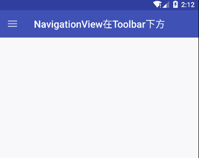
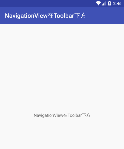
大多数的APP都是使用NavigationView都是全屏的,当我们想让NavigationView在Toolbar下方的时候应该怎么做呢
1 2 3 4 5 6 7 8 9 10 11 12 13 14 15 16 17 18 19 20 21 22 23 24 25 26 27 28 29 30 31 32 33 34 35 36 37 38 39 40 41 42 43 <LinearLayout xmlns:android ="http://schemas.android.com/apk/res/android" xmlns:app ="http://schemas.android.com/apk/res-auto" android:id ="@+id/sample_main_layout" android:layout_width ="match_parent" android:layout_height ="match_parent" android:orientation ="vertical" > <android.support.v7.widget.Toolbar android:id ="@+id/toolbar" android:layout_width ="match_parent" android:layout_height ="?attr/actionBarSize" android:background ="?attr/colorPrimary" app:theme ="@style/ThemeOverlay.AppCompat.Dark" /> <android.support.v4.widget.DrawerLayout android:id ="@+id/drawer_layout" android:layout_width ="match_parent" android:layout_height ="match_parent" > <FrameLayout android:id ="@+id/container" android:layout_width ="match_parent" android:layout_height ="match_parent" > <TextView android:padding ="16dp" android:text ="NavigationView在Toolbar下方" android:gravity ="center" android:layout_width ="match_parent" android:layout_height ="match_parent" /> </FrameLayout > <android.support.design.widget.NavigationView android:id ="@+id/nav_view" android:layout_width ="wrap_content" android:layout_height ="match_parent" android:layout_gravity ="start" android:fitsSystemWindows ="true" app:headerLayout ="@layout/nav_header_drawer_layout_one" app:menu ="@menu/activity_drawer_layout_one_drawer" /> </android.support.v4.widget.DrawerLayout > </LinearLayout >
效果如图:
NavigationView在Toolbar下方.gif
上图可以看到我们点击Home旋转开关按钮,显示和隐藏了侧滑菜单。那么如果我们想要不通过按钮点击,只能右划拉出菜单需要怎么做呢。
1
2
3
4
5
6
7
DrawerLayout drawer = (DrawerLayout) findViewById(R.id.drawer_layout);ActionBarDrawerToggle toggle = new ActionBarDrawerToggle (this , drawer, toolbar, R.string.navigation_drawer_open, R.string.navigation_drawer_close); drawer.setDrawerListener(toggle); toggle.syncState();
这个Home旋转开关按钮实际上是通过ActionBarDrawerToggle代码绑定到toolbar上的,ActionBarDrawerToggle是和DrawerLayout搭配使用的,它可以改变android.R.id.home返回图标,监听drawer的显示和隐藏。ActionBarDrawerToggle的syncState()方法会和Toolbar关联,将图标放入到Toolbar上。
1
2
3
4
5
6
public ActionBarDrawerToggle (Activity activity, DrawerLayout drawerLayout, @StringRes int openDrawerContentDescRes, @StringRes int closeDrawerContentDescRes) { this (activity, null , drawerLayout, null , openDrawerContentDescRes, closeDrawerContentDescRes); }
那么不带Home旋转开关按钮的代码如下
1 2 3 ActionBarDrawerToggle toggle = new ActionBarDrawerToggle (this , drawer, R.string.navigation_drawer_open, R.string.navigation_drawer_close);
当然我们把上面带Home旋转开关按钮的代码删除也是可以的。
效果如图:
Toolbar上不显示Home旋转开关按钮.gif
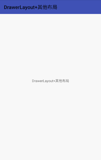
(五)、不使用NavigationView,使用DrawerLayout+其他布局 APP实际开发中往往不能完全按照Materialdesign的规则来,如网易云音乐的侧滑,底部还有两个按钮。这时候我们可以通过+其他布局来实现特殊的侧滑布局。
我们可以参考鸿杨大神的博客Design Support Library(1)]
我们自己实现个简单的,DrawerLayout包裹了一个FrameLayout和一个RelativeLayout,FrameLayout是我们的显示内容区域,RelativeLayout是我们的侧边栏布局。
1 2 3 4 5 6 7 8 9 10 11 12 13 14 15 16 17 18 19 20 21 22 23 24 25 26 27 28 29 30 31 32 33 34 35 36 37 38 39 40 41 42 43 44 45 46 47 48 49 50 51 52 53 54 55 56 <android.support.v4.widget.DrawerLayout android:id ="@+id/drawer_layout" xmlns:android ="http://schemas.android.com/apk/res/android" xmlns:app ="http://schemas.android.com/apk/res-auto" xmlns:tools ="http://schemas.android.com/tools" android:layout_width ="match_parent" android:layout_height ="match_parent" android:fitsSystemWindows ="true" tools:openDrawer ="start" > <FrameLayout android:id ="@+id/container" android:layout_width ="match_parent" android:layout_height ="match_parent" > <android.support.v7.widget.Toolbar android:id ="@+id/toolbar" android:layout_width ="match_parent" android:layout_height ="?attr/actionBarSize" android:background ="?attr/colorPrimary" app:popupTheme ="@style/AppTheme.PopupOverlay" /> <TextView android:layout_width ="match_parent" android:layout_height ="match_parent" android:gravity ="center" android:padding ="16dp" android:text ="@string/title_activity_drawer_layout_other" /> </FrameLayout > <RelativeLayout android:id ="@+id/nav_view" android:layout_width ="match_parent" android:layout_height ="match_parent" android:layout_gravity ="start" android:background ="@android:color/white" android:fitsSystemWindows ="true" > <Button android:layout_width ="match_parent" android:layout_height ="wrap_content" android:text ="这是顶部按钮" /> <Button android:layout_width ="match_parent" android:layout_height ="wrap_content" android:layout_centerInParent ="true" android:text ="这是中间的按钮" /> <Button android:layout_width ="match_parent" android:layout_height ="wrap_content" android:layout_alignParentBottom ="true" android:text ="这是底部按钮" /> </RelativeLayout > </android.support.v4.widget.DrawerLayout >
如果需要监听DrawerLayout的侧滑状态监听,那么代码如下:
1
2
3
4
5
6
7
8
9
10
11
12
13
14
15
16
mDrawerLayout = (DrawerLayout) findViewById(R.id.drawer_layout); mDrawerLayout.setDrawerListener(new DrawerLayout .SimpleDrawerListener() { @Override public void onDrawerClosed (View drawerView) { super .onDrawerClosed(drawerView); } @Override public void onDrawerOpened (View drawerView) { super .onDrawerOpened(drawerView); } });
效果图如下:
ActionBarDrawerToggle ActionBarDrawerToggle 是 DrawerLayout.DrawerListener实现。和 NavigationDrawer 搭配使用,推荐用这个方法,符合Android design规范。
作用:
2.Drawer拉出、隐藏,带有android.R.id.home动画效果。
3.监听Drawer拉出、隐藏;
ActionBarDrawerToggle 是在actionBar监视DrawerLayout的状态变化不要设置activity为无标题 :
1 // requestWindowFeature(Window.FEATURE_NO_TITLE);
实现:
绑定DrawerLayout,
实现两个方法:
1 2 3 4 5 6 7 8 9 10 11 12 13 14 15 16 17 18 19 20 21 22 23 24 25 26 27 28 29 mDrawerToggle = new ActionBarDrawerToggle ( MainActivity.this , mDrawerLayout, R.drawable.ic_drawer, R.string.drawer_open, R.string.drawer_close){ @Override public void onDrawerClosed (View drawerView) { super .onDrawerClosed(drawerView); getActionBar().setTitle(mTitle); invalidateOptionsMenu(); } @Override public void onDrawerOpened (View drawerView) { super .onDrawerOpened(drawerView); getActionBar().setTitle(mDrawerTitle); invalidateOptionsMenu(); } }; mDrawerLayout.setDrawerListener(mDrawerToggle); }
必须注意ActionBarDrawerToggle的使用必须在
1 2 3 4 5 6 7 8 9 10 11 12 13 14 15 16 @Override protected void onPostCreate (Bundle savedInstanceState) { super .onPostCreate(savedInstanceState); mDrawerToggle.syncState(); } @Override public void onConfigurationChanged (Configuration newConfig) { super .onConfigurationChanged(newConfig); mDrawerToggle.onConfigurationChanged(newConfig); }
更详细的例子
1
2
3
4
5
6
7
8
9
10
11
12
13
14
15
16
17
18
19
20
21
22
23
24
25
26
27
28
29
30
31
32
33
34
35
36
37
38
39
40
41
42
43
44
45
46
47
48
49
50
51
52
53
54
55
56
57
58
59
60
61
62
63
64
65
66
67
68
69
70
71
72
73
74
75
76
77
78
79
80
81
82
83
84
85
86
87
88
89
90
91
92
93
94
95
96
97
98
99
100
101
102
103
104
105
106
107
108
ActionBarDrawerToggle 是 DrawerLayout.DrawerListener 实现。和 NavigationDrawer 搭配使用,推荐用这个方法,符合Android design规范。 我们先来看看 NavigationDrawer 里面的 ActionBarDrawerToggle 是如何编写的。 mDrawerToggle = new ActionBarDrawerToggle ( getActivity(), mDrawerLayout, R.drawable.ic_drawer, R.string.navigation_drawer_open, R.string.navigation_drawer_close ) { @Override public void onDrawerClosed (View drawerView) { super .onDrawerClosed(drawerView); if (!isAdded()) { return ; } getActivity().invalidateOptionsMenu(); } @Override public void onDrawerOpened (View drawerView) { super .onDrawerOpened(drawerView); if (!isAdded()) { return ; } if (!mUserLearnedDrawer) { mUserLearnedDrawer = true ; SharedPreferences sp = PreferenceManager .getDefaultSharedPreferences(getActivity()); sp.edit().putBoolean(PREF_USER_LEARNED_DRAWER, true ).apply(); } getActivity().invalidateOptionsMenu(); } ActionBarDrawerToggle 的作用: 改变android.R.id.home返回图标。 Drawer拉出、隐藏,带有android.R.id.home动画效果。 监听Drawer拉出、隐藏; 有几点解释一下: 1. getActivity().invalidateOptionsMenu(); 在运行时改变menu item的状态。你需要重写onPrepareOptionsMenu() ,它方便你对item移除,添加,使不可用等。在android 3.0 以上,你必须调用invalidateOptionsMenu() 。当你要update你的menu时,因为action bar是一直出现的。然后系统将调用onPrepareOptionsMenu()更改menu。 Activity与Fragment中都有关于menu的一系列的方法,并且都是自动的在框架中回调的。其中onCreateOptionsMenu()只是在创建menu时调用一次,但menu存在的时候是不会重复调用的。更新menu时,从activity中主动的调用 invalidateOptionsMenu() 方法,那么activity在显示menu之前自然会回调onPrepareOptionsMenu(Menu menu),再在该方法内实现更新的细节即可。 如果Fragment中没有invalidateOptionsMenu()方法,并且当menu存在的时候fragment也不会调用onCreateOptionsMenu()方法,那么我们可以在Fragment中直接调用setHasOptionsMenu()方法,将该方法设置为true ,它就会调用onCreateOptionsMenu(),如此一来我们的目的就达到了。 2. isAdded();public final boolean isAdded () 如果该Fragment对象被添加到了它的Activity中,那么它返回true ,否则返回false 。先判断 Fragment 是否 add,这样就能做到多个Fragment切换不重新实例化。最后不要忘了 view sourceprint? 1 2 mDrawerLayout.setDrawerListener(mDrawerToggle);
demo: 效果图 :
布局文件最外层使用DrawerLayout
只可以有两个子布局
1
2
3
4
5
6
7
8
9
10
11
12
13
14
15
16
17
18
19
20
21
22
23
24
25
26
27
28
29
30
31
32
33
34
35
36
37
38
39
40
41
42
43
44
45
46
47
48
49
50
51
52
53
54
55
56
57
58
59
60
<?xml version="1.0" encoding="utf-8" ?> <android.support.v4.widget.DrawerLayout xmlns:android ="http://schemas.android.com/apk/res/android" xmlns:app ="http://schemas.android.com/apk/res-auto" xmlns:tools ="http://schemas.android.com/tools" android:id ="@+id/drawerLayout" android:layout_width ="match_parent" android:layout_height ="match_parent" android:fitsSystemWindows ="true" tools:openDrawer ="start" > <LinearLayout android:layout_width ="match_parent" android:layout_height ="match_parent" android:orientation ="vertical" > <android.support.v4.view.ViewPager android:id ="@+id/viewPager" android:layout_width ="match_parent" android:layout_height ="wrap_content" android:layout_weight ="1" > </android.support.v4.view.ViewPager > <android.support.design.widget.BottomNavigationView android:id ="@+id/bottomNavigationView" android:layout_width ="match_parent" android:layout_height ="50dp" android:background ="@color/white" app:itemIconTint ="@drawable/home_nav_item_color_state" app:itemTextColor ="@drawable/home_nav_item_color_state" app:menu ="@menu/home_navigation" > </android.support.design.widget.BottomNavigationView > </LinearLayout > <android.support.design.widget.NavigationView android:id ="@+id/navigationView" android:layout_width ="wrap_content" android:layout_height ="match_parent" android:layout_gravity ="left" android:fitsSystemWindows ="true" app:headerLayout ="@layout/home_nav_header" app:menu ="@menu/home_nav_drawer" > <RelativeLayout android:layout_width ="match_parent" android:layout_height ="match_parent" > <TextView android:layout_width ="match_parent" android:layout_height ="50dp" android:layout_alignParentBottom ="true" android:background ="@color/red" android:gravity ="center" android:text ="退出" /> </RelativeLayout > </android.support.design.widget.NavigationView > </android.support.v4.widget.DrawerLayout >
NavigationView
NavigationView侧滑菜单,可以自行填充头部布局和菜单布局,还可以再添加任意布局
在需要使用的页面添加如下代码
1
2
3
4
5
6
7
8
9
10
11
12
13
14
15
16
17
18
19
20
21
22
23
24
25
26
27
28
29
30
31
32
33
34
35
36
37
38
39
40
41
42
43
44
45
46
47
48
49
50
51
52
53
54
55
56
57
58
59
60
61
62
63
64
65
66
67
68
69
70
71
72
73
74
75
76
77
78
79
80
81
82
83
84
85
86
87
88
89
90
91
92
93
94
95
96
97
98
99
100
101
102
103
104
105
106
107
108
109
110
111
112
113
114
115
116
117
118
119
120
121
122
123
124
125
126
127
128
129
130
131
132
133
134
135
136
137
138
139
140
141
142
143
144
145
146
147
148
149
150
151
152
153
154
155
156
157
158
159
160
161
162
163
164
165
166
167
168
169
170
171
172
173
174
175
176
public class HomeActivity extends BaseActivity { private DrawerLayout drawerLayout; private ViewPager viewPager; private BottomNavigationView bottomNavigationView; private NavigationView navigationView; private TabFragmentPagerAdapter tabFragmentPagerAdapter;private List<Fragment> fragments;private MenuItem menuItem;private TextView tvHeader;private MenuItem menuItem1; private MenuItem menuItem2;private MenuItem menuItem3;private MenuItem menuItem4;@Override public int getLayoutId () { return R.layout.home_activity_home; } @Override public void initData () { initFragment(); } @Override public void initView () { drawerLayout = findView(R.id.drawerLayout); viewPager = findView(R.id.viewPager); bottomNavigationView = findView(R.id.bottomNavigationView); navigationView = findView(R.id.navigationView); initViewPager(); initBottomNavigationView(); initNavigationView(); } @Override public void initListener () {} @Override public void viewsClick (View view) {} private void initFragment () { fragments = new ArrayList <>(); fragments.add(new MainFragment ()); fragments.add(new ListFragment ()); fragments.add(new ThreeFragment ()); fragments.add(new StudyFragment ()); } private void initViewPager () { tabFragmentPagerAdapter = new TabFragmentPagerAdapter (getSupportFragmentManager(), fragments); viewPager.setAdapter(tabFragmentPagerAdapter); viewPager.addOnPageChangeListener(new ViewPager .OnPageChangeListener() { @Override public void onPageScrolled (int position, float positionOffset, int positionOffsetPixels) { } @Override public void onPageSelected (int position) { if (menuItem != null ) { menuItem.setChecked(false ); } else { bottomNavigationView.getMenu().getItem(0 ).setChecked(false ); } menuItem = bottomNavigationView.getMenu().getItem(position); menuItem.setChecked(true ); } @Override public void onPageScrollStateChanged (int state) { } }); } private void initBottomNavigationView () { BottomNavigationViewHelper.disableShiftMode(bottomNavigationView); bottomNavigationView.setOnNavigationItemSelectedListener(new BottomNavigationView .OnNavigationItemSelectedListener() { @Override public boolean onNavigationItemSelected (@NonNull MenuItem item) { menuItem = item; int i = item.getItemId(); if (i == R.id.navigation_home) { viewPager.setCurrentItem(0 ); return true ; } else if (i == R.id.navigation_list) { viewPager.setCurrentItem(1 ); return true ; } else if (i == R.id.navigation_Three) { viewPager.setCurrentItem(2 ); return true ; } else if (i == R.id.navigation_person) { viewPager.setCurrentItem(3 ); return true ; } return false ; } }); } private void initNavigationView () { tvHeader = navigationView.getHeaderView(0 ).findViewById(R.id.show_nav_head_text); menuItem1 = navigationView.getMenu().findItem(R.id.nav_item1); menuItem2 = navigationView.getMenu().findItem(R.id.nav_item2); menuItem3 = navigationView.getMenu().findItem(R.id.nav_item3); menuItem4 = navigationView.getMenu().findItem(R.id.nav_item4); ActionBarDrawerToggle toggle = new ActionBarDrawerToggle ( this , drawerLayout, R.string.home_drawer_open, R.string.home_drawer_close) { @Override public void onDrawerSlide (View drawerView, float slideOffset) { View mContent = drawerLayout.getChildAt(0 ); float scale = 1 - slideOffset; float endScale = 0.8f + scale * 0.2f ; float startScale = 1 - 0.3f * scale; drawerView.setScaleX(startScale); drawerView.setScaleY(startScale); drawerView.setAlpha(0.6f + 0.4f * (1 - scale)); mContent.setTranslationX(drawerView.getMeasuredWidth() * (1 - scale)); mContent.invalidate(); mContent.setScaleX(endScale); mContent.setScaleY(endScale); } }; toggle.syncState(); drawerLayout.addDrawerListener(toggle); navigationView.setItemIconTintList(null ); navigationView.setNavigationItemSelectedListener(new NavigationView .OnNavigationItemSelectedListener() { @Override public boolean onNavigationItemSelected (@NonNull MenuItem item) { if (item == menuItem1) { drawerLayout.closeDrawer(GravityCompat.START); } else if (item == menuItem2) { drawerLayout.closeDrawer(GravityCompat.START); } else if (item == menuItem3) { drawerLayout.closeDrawer(GravityCompat.START); } else if (item == menuItem4) { drawerLayout.closeDrawer(GravityCompat.START); } return true ; } }); tvHeader.setOnClickListener(new View .OnClickListener() { @Override public void onClick (View v) { Toast.makeText(HomeActivity.this , "登录成功" , Toast.LENGTH_LONG).show(); } }); } }
4、CoordinatorLayout https://blog.csdn.net/jxf_access/article/details/79564669